Style Over Substance: An Introduction To Brutalist Website Design
Article Updated on March 7, 2026
When it comes to website design, there are tonnes of guides online that speak about best practises to optimise your website and squeeze out every possible little bit of conversion juice from the site.
But, what happens if you don’t follow these guides?
What happens if you make the underlying principle of your website “to go against everything the standard best practise advice ever said about design”?
In this article I hope to introduce and discuss the design philosophy of Brutalism, with specific focus on the role that subversive and truly unique brutalist design can play in helping a brand to stand out from the crowd.
What is Brutalist Web Design?
The term brutalism comes from the French word for “raw”, and in the context of Web Design refers to the use of simple but expressive forms that side-step the vanilla aesthetics found all over the place in the modern corporate design world.
When it comes to web design, Brutalism laughs in the face of conventional design choices, preferring instead to stick with over the top and superficial decoration which ultimately underpins the brutalist philosophy of raw and expressive style over refined substance.
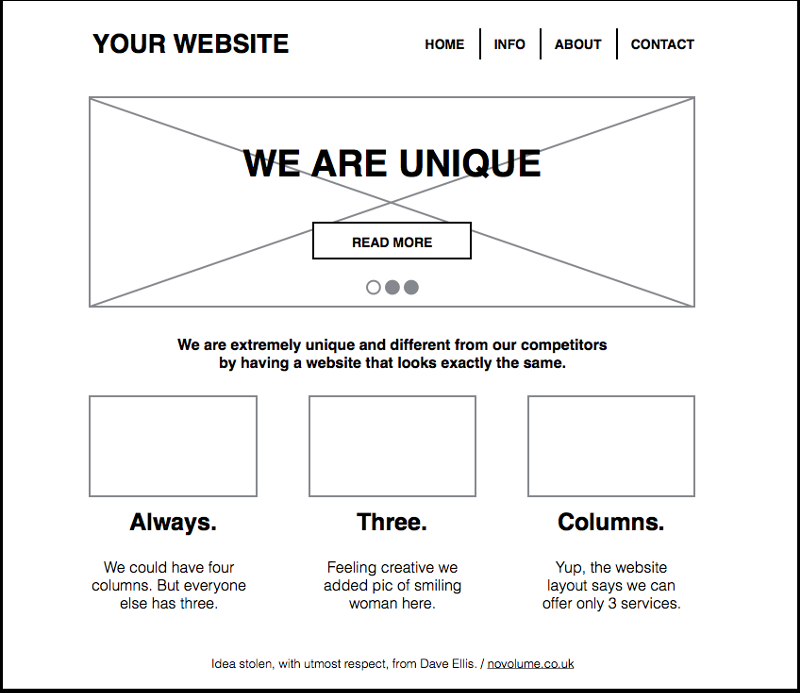
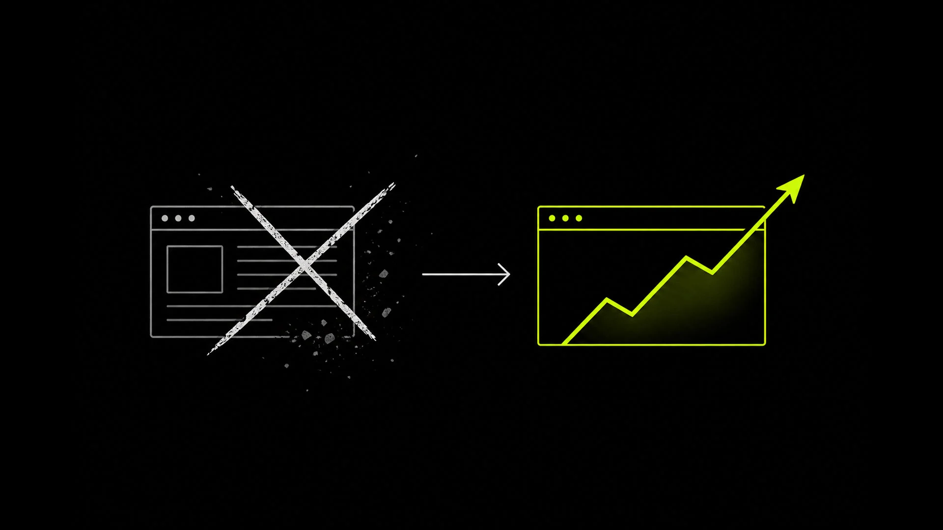
An example of basically every startup’s website in 2018. Honestly, even our site used to look like this.
Style Over Substance: How Design can Disrupt Media Consumption Patterns
In today’s lean startup culture, the position of brutalist aesthetics over the functionality of user experience becomes a bold branding position. Bold, because it is risky due to sites becoming more and more homogenous over time.
As more and more people get used to the web looking a certain way, having something a bit different becomes more and more of a risk – a risk that could easily cost you a sale, misdirect a potential customer or otherwise alienate your audience out of pure confusion.
However, the reasons why brutalists designs can fail is also the reason why they can also be massively successful. Due to over-saturation of media in our modern age, breaking all of the design rules can be a sound way to jam the consumers regular pattern of media consumption – as a brutalist website design forces your audience to really pay extra attention if they are to process and comprehend all of the details.
If you are a business that target customers who are in a relatively free-thinking psychographic segments – think students, those in underground music scenes, or other “challenger” type audiences – then brutalist design choices can give your brand a cool factor that makes it very easy to set aside from the competition due to it’s distinctive look and feel.
Ultimately, brutalism is not a very new idea, as underground music scenes such as Punk, Hip Hop & others have differentiate themselves through shocking uses of fashion, ideology, symbols and other general aesthetics.
But Brutalism is always being applied in new ways, and new contexts. With even car leasing companies such as LingsCars adopting a brutalist aesthetic to position themselves as far apart from competitors.
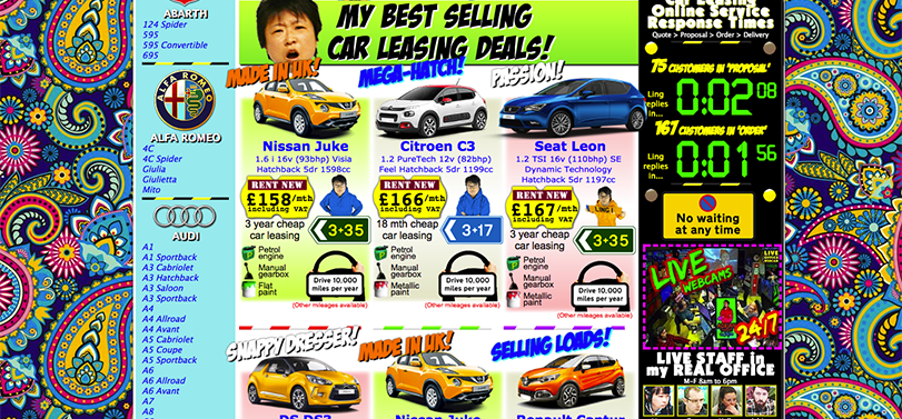 LingsCars has been called the “worlds worst website” but did you know that it is one of the most profitable businesses in the entire car leasing industry? Hmm…
Today’s biggest stars, are creative, unrefined and emotional
In the past, our celebrities and famous figures appear to be more polished, distant and homogenous. However, in the age of social media it is larger than life, eccentric characters like Kanye West & Donald Trump who steal the limelight, and manipulate the media for free publicity with their antics.
Consider Kanye West’s The Life Of Pablo, (pictured below), franky the cover art looks like it was designed in microsoft paint on the tail end of a cocaine binge, however this didn’t stop Kanye from topping the US Top 100s for 7 weeks and selling nearly 30,000 physical albums.
Perhaps Kanye’s use of a “culture jamming-like album cover, that confused and disorientated consumers in a way that lead to increased word of mouth, publicity and media drama that resulted in free press to promote the album.
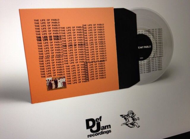
Does this look like a normal Top 100’s chart album cover or more like part of an art dissertation?
Even if the cover didn’t contribute hugely to the sales volume of The Life Of Pablo, it certainly identifies Kanye as an appreciator the the pure, and raw form of self expression known as brutalism.
When and why would you use a Brutalist Design?
We can find the roots of this of brutalist design philosophy in the anarchists, beatniks and postmodernists of the 1960’s & 1970’s counterculture and underground scenes. Often the design will have a handmade or almost intentionally bad, diy look and feel to position the brand as radical, anti-corporate and unique.
Just like the remix philosophy regularly found in styles of Hip-Hop and other Electronic music such as Drum ‘n’ Bass, the brutalist artist remixes or otherwise subverts popularly known shapes and forms to give there art a decidedly anti-corporate and anti-mainstream stance.
Brutalism borrows from the psycadelic and absurd, as well as subverting or manipulating the forms provided to us via mainstream advertising to create something strikingly attention grabbing.
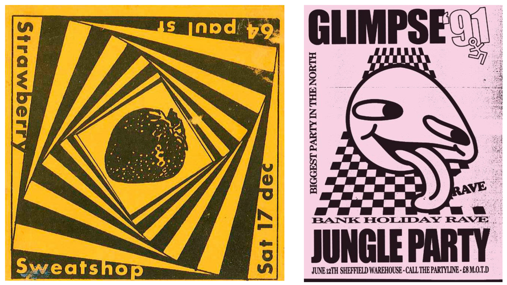
These psychedelic rave flyers from the 90’s evoke the brutalist philosophy of raw expression over information clarity
When applied to a brand, adopting the traits of brutalist design can work perfectly to position said brand as challenger to other mainstream offerings in the marketplace. I’ll say again that this style of design definantly won’t work for everyone.
In fact, i’d so as far to say that would be a huge misfire for say Tesco to role out some sort of artisticly styled food section because this style of design works best for underdog brands who can position themselves as a lone nomad, playing by their own rules.
What are some examples of Brutalist Website Designs?
To the uninitiated, the following websites may look visually offensive, sloppy and poorly thought out.
However be warned, despite the fact that these websites are highly unconventional and occasionally a little weird they are all from highly successful companies who have developed a loyal and well engaged audience by using guerrila design techniques in there marketing to go against the crowd.
Kappa Kontrol
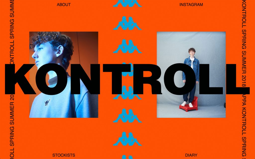
Kappa Kontroll is an Italian clothing line that became popular in the 1980’s for its distinctive look and striking colour combinations and when it comes to their website, they don’t hold back on the interesting aesthetics they used to build and sustain the brand all these years.
This design reinforces the brands unique design and market positioning, as well as underlining a commitment to style and aesthetics that would be expected from a clothing line.
While many competing brands in the same space such as Nike & Adidas have souped up there ecommerce offerings in order to compete with growing online retailers and cope with declining high street sales.
Kappa has gone completely in the other direction and embraced there street philosophy by saying no to the check out, and displaying a limited selection of products.
Despite this radical and impractical website layout, these choices don’t seem to have hurt the Kappa brand, which has been said to be going through a somewhat of a revival in the certain streetwear circles and by fans.
Robin Jasni
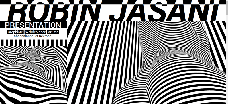
Robin Jasini is a French Graphic Designer who gave his portfolio website a unique appearance in order to assist with finding a job.
His site is very simple, but shows great technical ability by using custom animations and a striking design, which effectively displays his dedication to his craft.
Phunk Studios
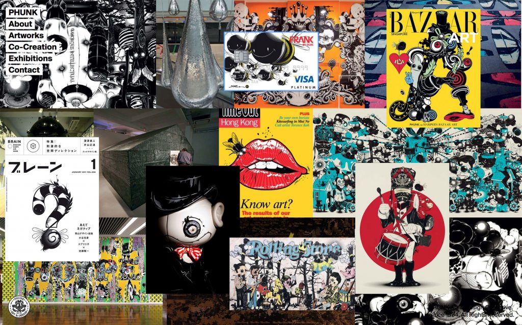
Phunk Studio’s is a contemporary art and design collective from singapore and “Asia’s hottest agency” who have chosen a very authentic way to display there work with a portfolio layout that is reminiscent of collection of flyers on a notice board or wall of stickers.
This unique design prompts the user to hover around and displays the selected portfolio piece upon clicking which is a novel way to give your website a sort of underground music venue kinda vibe or urban look & feel.
Shop.kanyewest.com
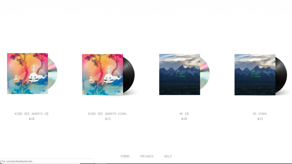
Kanye West’s ecommerce store is very understated and effective but also quite subversive to design conventions with a lot of interesting choices being made.
For starters, Kanye’s ecommerce store has practically no navigation, but this simplicity is echoed throughout the site as we also see rebellion from most of the conventional design principles; such as no “rich sticky” content, no banner advertisements or lengthy about us sections. It’s simply 4 products, with no descriptions and their respective prices.
In a way, this website is highly in tune with Kanye’s overall brand, appearance and overall fashion choices, which are often quite clean and simple in compared to the blinged out styles of 90’s hip-hop and contemporaries like Drake.
Obviously, Kanye has no need for SEO tricks and digital content strategies to get his name out there and staying away from this perhaps creates a more authentic brand experience in this instance.
En.tight.media
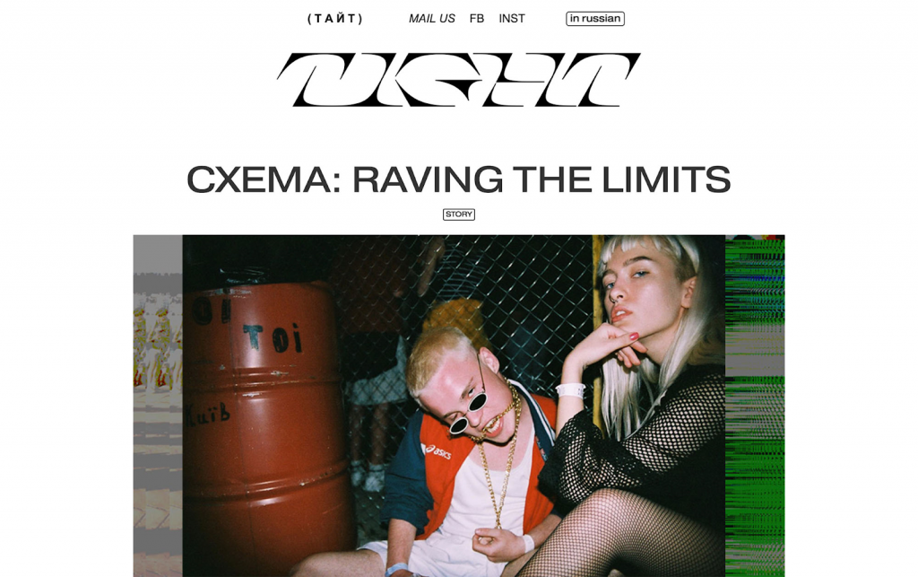
The en.tight.media website really makes me feel a particular way. It’s like i’m nostalgic but for the future.
I think the choice of strange textures, interesting fonts and dynamic photography really helps to invoke a vibe, as well as sense of community through subculture that is truly off the beat of mainstream audiences.
Conclusion
Ultimately, Brutalism is a style where freedom of expression takes precedence over more rational concepts like user experience, functionality and conversion optimisation. That being said, Brutalism is clearly not a style that is suitable for every business.
However, if individuality and a distinctive art style is more suited to your business, then a brutalist aesthetic can give your website exactly what it needs to stand out against a market of homogenous copycats, open source design libraries and free fonts that plague the web.
The brutalist website redefines the standard forms of browsing and forgos the homogenisation of design with gigantic hover effect, garish imagery and unusable links to intentionally broken pages.
The essence of brutalism is about doing away with what is practical, but in a very intentional and often complex way. These designs force us to question the design methodology of the every day website, and help us to consider new ideas and structural forms that may be useful, or even revolutionary to the field of design.
If you’d like to take a look at more brutalist website examples, check out the brutalist design category over at awwwards or visit the brutalist websites database
Thanks for reading, if you have a brutalist design resource you’d like to add to this list. Leave us a comment below or drop us an email at team@trendjackers.com
Comments
Comments are closed.
Style Over Substance: An Introduction To Brutalist Website Design
Article Updated on March 7, 2026

When it comes to website design, there are tonnes of guides online that speak about best practises to optimise your website and squeeze out every possible little bit of conversion juice from the site.
But, what happens if you don’t follow these guides?
What happens if you make the underlying principle of your website “to go against everything the standard best practise advice ever said about design”?
In this article I hope to introduce and discuss the design philosophy of Brutalism, with specific focus on the role that subversive and truly unique brutalist design can play in helping a brand to stand out from the crowd.
What is Brutalist Web Design?
The term brutalism comes from the French word for “raw”, and in the context of Web Design refers to the use of simple but expressive forms that side-step the vanilla aesthetics found all over the place in the modern corporate design world.
When it comes to web design, Brutalism laughs in the face of conventional design choices, preferring instead to stick with over the top and superficial decoration which ultimately underpins the brutalist philosophy of raw and expressive style over refined substance.
An example of basically every startup’s website in 2018. Honestly, even our site used to look like this.
Style Over Substance: How Design can Disrupt Media Consumption Patterns
In today’s lean startup culture, the position of brutalist aesthetics over the functionality of user experience becomes a bold branding position. Bold, because it is risky due to sites becoming more and more homogenous over time.
As more and more people get used to the web looking a certain way, having something a bit different becomes more and more of a risk – a risk that could easily cost you a sale, misdirect a potential customer or otherwise alienate your audience out of pure confusion.
However, the reasons why brutalists designs can fail is also the reason why they can also be massively successful. Due to over-saturation of media in our modern age, breaking all of the design rules can be a sound way to jam the consumers regular pattern of media consumption – as a brutalist website design forces your audience to really pay extra attention if they are to process and comprehend all of the details.
If you are a business that target customers who are in a relatively free-thinking psychographic segments – think students, those in underground music scenes, or other “challenger” type audiences – then brutalist design choices can give your brand a cool factor that makes it very easy to set aside from the competition due to it’s distinctive look and feel.
Ultimately, brutalism is not a very new idea, as underground music scenes such as Punk, Hip Hop & others have differentiate themselves through shocking uses of fashion, ideology, symbols and other general aesthetics.
But Brutalism is always being applied in new ways, and new contexts. With even car leasing companies such as LingsCars adopting a brutalist aesthetic to position themselves as far apart from competitors.
LingsCars has been called the “worlds worst website” but did you know that it is one of the most profitable businesses in the entire car leasing industry? Hmm…
Today’s biggest stars, are creative, unrefined and emotional
In the past, our celebrities and famous figures appear to be more polished, distant and homogenous. However, in the age of social media it is larger than life, eccentric characters like Kanye West & Donald Trump who steal the limelight, and manipulate the media for free publicity with their antics.
Consider Kanye West’s The Life Of Pablo, (pictured below), franky the cover art looks like it was designed in microsoft paint on the tail end of a cocaine binge, however this didn’t stop Kanye from topping the US Top 100s for 7 weeks and selling nearly 30,000 physical albums.
Perhaps Kanye’s use of a “culture jamming-like album cover, that confused and disorientated consumers in a way that lead to increased word of mouth, publicity and media drama that resulted in free press to promote the album.
Does this look like a normal Top 100’s chart album cover or more like part of an art dissertation?
Even if the cover didn’t contribute hugely to the sales volume of The Life Of Pablo, it certainly identifies Kanye as an appreciator the the pure, and raw form of self expression known as brutalism.
When and why would you use a Brutalist Design?
We can find the roots of this of brutalist design philosophy in the anarchists, beatniks and postmodernists of the 1960’s & 1970’s counterculture and underground scenes. Often the design will have a handmade or almost intentionally bad, diy look and feel to position the brand as radical, anti-corporate and unique.
Just like the remix philosophy regularly found in styles of Hip-Hop and other Electronic music such as Drum ‘n’ Bass, the brutalist artist remixes or otherwise subverts popularly known shapes and forms to give there art a decidedly anti-corporate and anti-mainstream stance.
Brutalism borrows from the psycadelic and absurd, as well as subverting or manipulating the forms provided to us via mainstream advertising to create something strikingly attention grabbing.
These psychedelic rave flyers from the 90’s evoke the brutalist philosophy of raw expression over information clarity
When applied to a brand, adopting the traits of brutalist design can work perfectly to position said brand as challenger to other mainstream offerings in the marketplace. I’ll say again that this style of design definantly won’t work for everyone.
In fact, i’d so as far to say that would be a huge misfire for say Tesco to role out some sort of artisticly styled food section because this style of design works best for underdog brands who can position themselves as a lone nomad, playing by their own rules.
What are some examples of Brutalist Website Designs?
To the uninitiated, the following websites may look visually offensive, sloppy and poorly thought out.
However be warned, despite the fact that these websites are highly unconventional and occasionally a little weird they are all from highly successful companies who have developed a loyal and well engaged audience by using guerrila design techniques in there marketing to go against the crowd.
Kappa Kontrol
Kappa Kontroll is an Italian clothing line that became popular in the 1980’s for its distinctive look and striking colour combinations and when it comes to their website, they don’t hold back on the interesting aesthetics they used to build and sustain the brand all these years.
This design reinforces the brands unique design and market positioning, as well as underlining a commitment to style and aesthetics that would be expected from a clothing line.
While many competing brands in the same space such as Nike & Adidas have souped up there ecommerce offerings in order to compete with growing online retailers and cope with declining high street sales.
Kappa has gone completely in the other direction and embraced there street philosophy by saying no to the check out, and displaying a limited selection of products.
Despite this radical and impractical website layout, these choices don’t seem to have hurt the Kappa brand, which has been said to be going through a somewhat of a revival in the certain streetwear circles and by fans.
Robin Jasni
Robin Jasini is a French Graphic Designer who gave his portfolio website a unique appearance in order to assist with finding a job.
His site is very simple, but shows great technical ability by using custom animations and a striking design, which effectively displays his dedication to his craft.
Phunk Studios
Phunk Studio’s is a contemporary art and design collective from singapore and “Asia’s hottest agency” who have chosen a very authentic way to display there work with a portfolio layout that is reminiscent of collection of flyers on a notice board or wall of stickers.
This unique design prompts the user to hover around and displays the selected portfolio piece upon clicking which is a novel way to give your website a sort of underground music venue kinda vibe or urban look & feel.
Shop.kanyewest.com
Kanye West’s ecommerce store is very understated and effective but also quite subversive to design conventions with a lot of interesting choices being made.
For starters, Kanye’s ecommerce store has practically no navigation, but this simplicity is echoed throughout the site as we also see rebellion from most of the conventional design principles; such as no “rich sticky” content, no banner advertisements or lengthy about us sections. It’s simply 4 products, with no descriptions and their respective prices.
In a way, this website is highly in tune with Kanye’s overall brand, appearance and overall fashion choices, which are often quite clean and simple in compared to the blinged out styles of 90’s hip-hop and contemporaries like Drake.
Obviously, Kanye has no need for SEO tricks and digital content strategies to get his name out there and staying away from this perhaps creates a more authentic brand experience in this instance.
En.tight.media
The en.tight.media website really makes me feel a particular way. It’s like i’m nostalgic but for the future.
I think the choice of strange textures, interesting fonts and dynamic photography really helps to invoke a vibe, as well as sense of community through subculture that is truly off the beat of mainstream audiences.
Conclusion
Ultimately, Brutalism is a style where freedom of expression takes precedence over more rational concepts like user experience, functionality and conversion optimisation. That being said, Brutalism is clearly not a style that is suitable for every business.
However, if individuality and a distinctive art style is more suited to your business, then a brutalist aesthetic can give your website exactly what it needs to stand out against a market of homogenous copycats, open source design libraries and free fonts that plague the web.
The brutalist website redefines the standard forms of browsing and forgos the homogenisation of design with gigantic hover effect, garish imagery and unusable links to intentionally broken pages.
The essence of brutalism is about doing away with what is practical, but in a very intentional and often complex way. These designs force us to question the design methodology of the every day website, and help us to consider new ideas and structural forms that may be useful, or even revolutionary to the field of design.
If you’d like to take a look at more brutalist website examples, check out the brutalist design category over at awwwards or visit the brutalist websites database
Thanks for reading, if you have a brutalist design resource you’d like to add to this list. Leave us a comment below or drop us an email at team@trendjackers.com
Comments
-
Sarah Hunt November 22, 2018 at 12:57 am
Absolutely love these designs. So true that the best way to innovate and be interesting is design is to let all your competitors ride trends forward, and then you step backwards and take old ideas like the terrible designs of early e-commerce websites (LingsCars), or just school-project style art (Life of Pablo). Website design is incredibly same-y at the moment. If you have the kind of business that wants to stand out from the crowd, an interesting website is an awesome gable to make. Is UX compromised? Maybe. But are your customers more into you than your competitiors? Very likely. Given the cost of designing a website, it’s a risk that may not be testable, but if you do your research and really get to know your desired audience, you’ll make the right call.
-
Rob Thompson November 27, 2018 at 2:23 pm
Hi Sarah, appreciate your thoughtful comment. I agree that its very easy to fall into the trap of trying to “keep up with the competition” which ultimately has causes there to be quite a lot of websites and brands that look exactly alike. It’s a fair comment that there may be a negative impact on UX, but at the end of the day how are we to know for sure without testing it for ourselves?
I spoke with Ling from LingsCars a couple of months back and she told me that she previously ran an experiment where she advertised her car leasing services under a different brand, with a more standard design that you’d expect from the automotive industry.
The results where that the more typical looking site actually performed worse in terms of traffic and conversion, so perhaps if you have the drive to be creative with your brand then brutalist design is completely your best option.
However, I think that you can’t just have say, a normal accountant business and attempt one of these crazy sites. These design examples underline a philosophy that will have to resonates throughout your brand at ever consumer touchpoint to be considered authentic.
-
-
Anonymous August 9, 2023 at 11:08 pm
Superb post however I was wanting to know if you could write a litte more on this topic? I’d be very grateful if you could elaborate a little bit more.
Comments are closed.


Absolutely love these designs. So true that the best way to innovate and be interesting is design is to let all your competitors ride trends forward, and then you step backwards and take old ideas like the terrible designs of early e-commerce websites (LingsCars), or just school-project style art (Life of Pablo). Website design is incredibly same-y at the moment. If you have the kind of business that wants to stand out from the crowd, an interesting website is an awesome gable to make. Is UX compromised? Maybe. But are your customers more into you than your competitiors? Very likely. Given the cost of designing a website, it’s a risk that may not be testable, but if you do your research and really get to know your desired audience, you’ll make the right call.
Hi Sarah, appreciate your thoughtful comment. I agree that its very easy to fall into the trap of trying to “keep up with the competition” which ultimately has causes there to be quite a lot of websites and brands that look exactly alike. It’s a fair comment that there may be a negative impact on UX, but at the end of the day how are we to know for sure without testing it for ourselves?
I spoke with Ling from LingsCars a couple of months back and she told me that she previously ran an experiment where she advertised her car leasing services under a different brand, with a more standard design that you’d expect from the automotive industry.
The results where that the more typical looking site actually performed worse in terms of traffic and conversion, so perhaps if you have the drive to be creative with your brand then brutalist design is completely your best option.
However, I think that you can’t just have say, a normal accountant business and attempt one of these crazy sites. These design examples underline a philosophy that will have to resonates throughout your brand at ever consumer touchpoint to be considered authentic.
Superb post however I was wanting to know if you could write a litte more on this topic? I’d be very grateful if you could elaborate a little bit more.