Tradesman Website Branding: Your Website Is Your Van (2026)
Article Updated on May 5, 2026
Quick answer. Your website is your van. Same business, same craft, same standard expected. Most tradesman websites fail this test, not because tradesmen are bad at their work, but because the website was treated as an afterthought.
This piece is about why pride in craft demands pride in website, with the brand-personality framework that explains why trade brands live in ruggedness × competence, and what a “dirty van online” looks like, quantified from an audit of 350 sites.
Already know your site doesn’t say what you want?
See what “done right” actually looks like.
Want the data behind it?
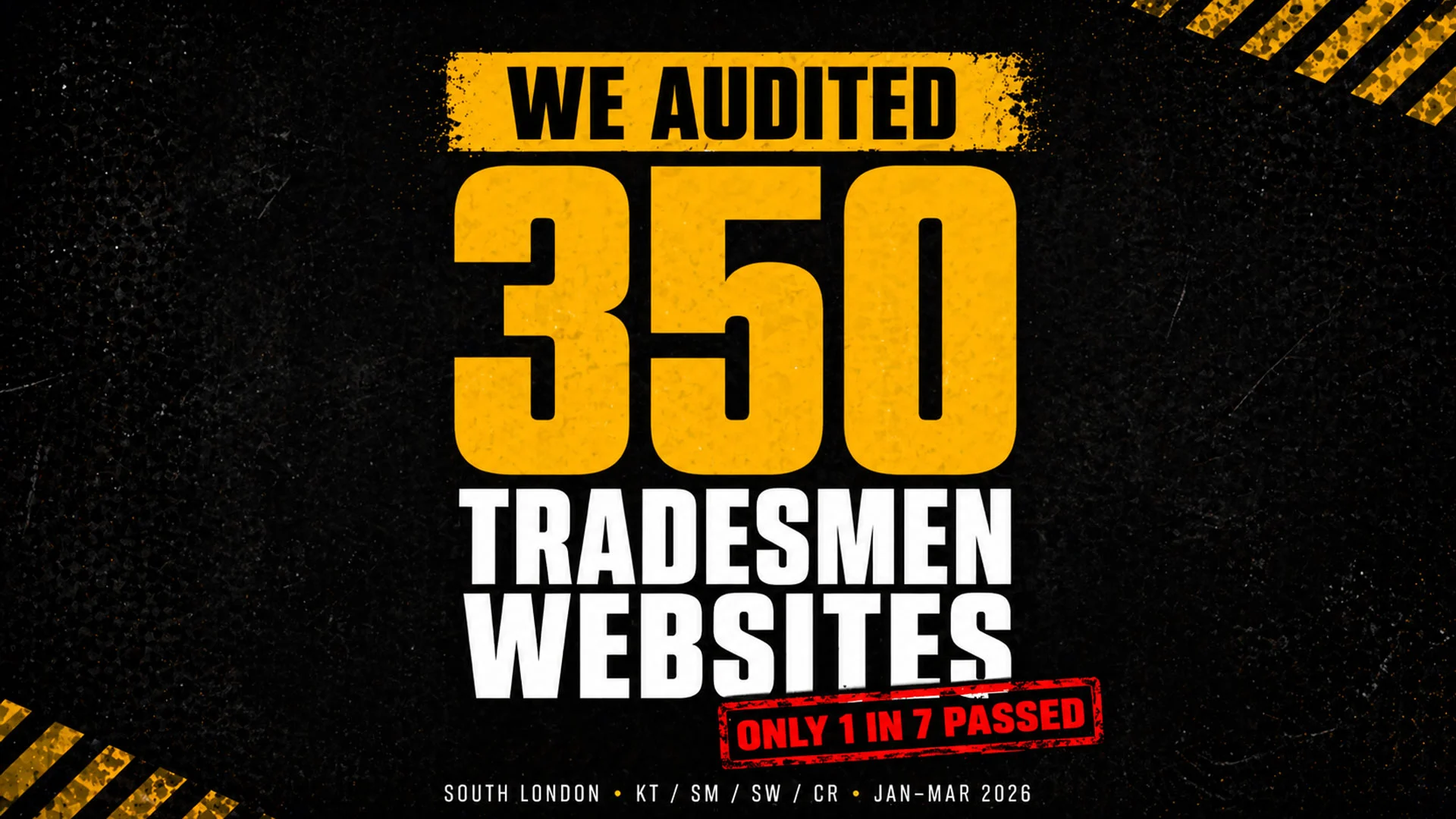
I audited 350 tradesman websites in South London. The dirty-van numbers are below, full audit linked.
A good tradesman would never turn up to a quote in a van with peeling vinyl, a cracked bumper, and last week’s McDonald’s on the dashboard. You know why. The van says something before you open your mouth. It tells the customer whether you take your work seriously. Whether you pay attention to detail. Whether you give a shit.
Your website is your van now. And most of you are driving around in the digital equivalent of a Transit with bald tyres and a missing wing mirror.
I don’t say this as an insult. I say it as someone who’s spent the last few months auditing 350 tradesman websites across Kingston, Sutton, and South West London, and who found that only about 1 in 7 were genuinely doing their job. The other six in seven had broken contact forms, placeholder text nobody ever replaced, copyright dates from 2011, casino spam injected into the code, and in one memorable case, a “Book A Visit” button that sent customers to a completely different business.
What surprised me wasn’t the state of the sites. It was who they belonged to. These weren’t cowboys. They were proper tradesmen with decades of experience, hundreds of five-star reviews, Gas Safe registrations, City and Guilds certificates, family businesses going back generations. Masters of their craft. Absolute professionals in every part of their work except one: the bit the customer sees first.
Tradesmen are designers. Most of you just don’t know it yet.
Here’s something I think most tradespeople never hear: what you do is design.
Not design in the graphic design sense, with Macs and mood boards. Design in the fundamental sense: solving problems within constraints to create something that works and lasts.
Think about the last time you ran pipework through a tight space. You had to account for the existing joists, the fall angle for drainage, the access points for future maintenance, and how the finished boxing would look in the room. You were balancing function against aesthetics against practicality against building regulations, all simultaneously, in real time, standing on a ladder. An architect would call that spatial problem-solving under constraints. You call it Thursday.
An electrician designs circuits. The wire gauge, the ring configuration, the consumer unit layout, the positioning of sockets and switches so they’re functional and invisible at the same time. A builder designs spaces. A roofer designs the protection layer between a family and the weather. A tiler designs surfaces that have to be level, waterproof, and beautiful for 20 years. A landscaper literally reshapes the earth into something someone wants to look at every morning with their coffee.
Every trade involves taking raw materials, understanding constraints, and creating something that works and lasts. That’s design. And if you’re a designer, your website is a piece of your design portfolio. Right now, for a lot of tradespeople, it’s the weakest piece in the collection.
Design integrity: why your website is a surface, not a separate thing
In branding, there’s a concept called “design integrity.” It means that every touchpoint a customer encounters should reflect the same standard of care. The quote document. The invoice. The van livery. The uniform. The way you leave a site after finishing. The follow-up call. The website. Each one is a surface where your standards are either visible or absent.
Jennifer Aaker’s brand personality research at Stanford (Aaker, 1997, Journal of Marketing Research) identifies five dimensions customers use to judge businesses: sincerity, excitement, competence, sophistication, and ruggedness. For tradespeople, the dimensions that matter are competence and ruggedness. Sincerity is one-dimensional. Excitement is gimmicky. Sophistication reads as agency-flavoured, the wrong signal entirely. Competence and ruggedness are where trade brands live. The sense that this person knows what they’re doing, and gets it done.
You can see the position before you read the theory. Most trade brands default to trusting blues for the competence half: plumbers, electricians, locksmiths, bathroom fitters. The ones that work on-site under load default to worker-bee yellow and black for the ruggedness half: scaffolders, demolition crews, civils. Hi-vis isn’t fashion. It’s a brand-personality choice that tradespeople made before they knew the term. The colour you wear, the colour on your van, the colour on your invoices: it’s all the same coordinate.
Your work communicates competence. Your van communicates ruggedness. Your website should communicate both. When tradesman website branding fails, it doesn’t fail by choosing the wrong dimension. They fail by inheriting some web designer’s “modern, minimalist” template that pulls the whole brand toward sophistication. That’s a different brand, in a different industry, talking to a different customer.
When it communicates neither, because it’s running a template from 2016 with “Your Heading” in the services section and an @hotmail email as the primary contact, there’s a gap between who you are and how you appear. In psychology, that gap is called cognitive dissonance: the discomfort a person feels when they encounter conflicting signals.
“Dave said this plumber is brilliant” is signal one. “But his website looks like it was abandoned five years ago” is signal two. The customer has to resolve the conflict, and they usually resolve it by choosing someone whose signals are aligned. Even if that someone does worse work than you.
We explored how deliberate, unconventional design choices can actually strengthen a brand when they’re intentional. LingsCars looks chaotic, but every design choice is deliberate. The tradesman websites in my audit aren’t making deliberate choices. They’re making no choices at all. That’s the difference between a bold brand and a neglected one.
The dirty van problem, quantified
Every tradesman I know has an opinion about other tradesmen’s vans. You notice the ones with fresh livery and organised racking. You notice the ones with duct tape on the bumper. You draw conclusions from both.
Customers do the same with your website, except your website gets seen before your van does.
From the 350 websites I audited, here’s what “a dirty van” looks like online:
What I found in 350 sites
| # | Failure mode | Sites | % of 350 |
|---|---|---|---|
| 1 | Broken or placeholder images | 47 | 13.4% |
| 2 | Stale copyright dates (pre-2025) | 41 | 11.7% |
| 3 | No mobile viewport tag | 37 | 10.6% |
| 4 | Gmail or Hotmail business email | 18 | 5.1% |
| 5 | No SSL certificate | 14 | 4.0% |
47 had broken or placeholder images. Where photos of completed kitchens, rewired fuse boxes, and tiled bathrooms should be, there were transparent 1×1 pixel GIFs, grey SVG rectangles, and base64-encoded blanks. One landscaper’s portfolio section was entirely populated with invisible placeholder files. His customers see a gallery of nothing.
37 had no mobile viewport tag. Their sites don’t resize for phones, meaning text is unreadable and buttons are untappable on the device 60%+ of their customers are searching from.
41 had copyright dates from before 2025. I found footer years of 2011, 2015, 2018, 2020. One had 2027, which is a different kind of carelessness but equally telling.
18 used Gmail or Hotmail as their business email despite owning a professional domain. d_p*@hotmail.co.uk on a site that says “Professional Plumbing Services” is the online equivalent of turning up to a quote in paint-stained joggers.
14 had no SSL certificate. Chrome displays “Your connection is not private” as a full-screen warning before the visitor sees the homepage.
These aren’t edge cases. This is what a significant proportion of tradesman websites actually look like. And every one of these businesses is paying for Checkatrade or MyBuilder on top, building a reputation on platforms they don’t own while the platform they do own undermines that reputation with every visit.
Daniel Kahneman’s research on decision-making shows that humans feel the pain of a loss roughly twice as intensely as the pleasure of an equivalent gain. Every customer who lands on your broken website and quietly calls someone else is a loss you never see. The job you didn’t get. The review you didn’t receive. The referral that never happened. Invisible losses, compounding silently, month after month.
Your competitor’s work isn’t better than yours. His website is.
This is the one that should sting.
Somewhere in your postcode, right now, there’s a tradesman whose work is mediocre. You’ve probably seen it. Sloppy finishing, shortcuts in the materials, customers who aren’t fully satisfied but don’t want the hassle of complaining. But he’s got a website. A proper one. Clean, mobile-friendly, his phone number at the top, real photos of his jobs (even if the jobs aren’t that impressive to a trained eye), a few Google reviews, a professional email address.
When a homeowner in your area searches “plumber Kingston” or “electrician Sutton” or “roofer New Malden, ” that guy shows up. You don’t. He gets the call. He gets the job. Not because he’s better. Because he’s visible and you’re not.
And here’s the part that really burns: he probably knows his work isn’t as good as yours. He’s seen your work on the same street. He knows. But it doesn’t matter. Because the customer never got far enough to compare the actual work. The comparison happened on Google, and on Google, he won. Because he showed up and you didn’t.
In marketing, Byron Sharp calls this “physical availability”: being present at the moment a customer is looking to buy. You can be the most skilled tradesman in South London, but if you’re not physically available when someone searches for your trade in your area, the less skilled but more visible competitor wins. Every single time.
This is the part where competitive pride should kick in. Not vanity. Professional pride. The same instinct that makes you redo a joint that nobody will ever see, because you know it’s there and you know it’s right. The same standard that makes you stay an extra hour to get the finish perfect. That standard should apply to your website too. Because your website is visible. And your competitor’s is better.
Shortcuts cost more than they save
Every tradesman knows that shortcuts come back around. The pipe joint you didn’t solder properly leaks in six months. The wire you didn’t terminate correctly trips the board. The wall you didn’t key before plastering cracks within a year. Shortcuts don’t save time. They defer cost and multiply it.
Your website is exactly the same.
The £200 you saved by going with the cheapest web designer who used a template and never replaced the placeholder text? That’s costing you enquiries every single day. When I audited sites in South London, I found ALBDECO in Kingston with unrendered template variables like {{total_slide_count}} visible to visitors. I found Dr H2O in Carshalton with a misspelled javascipt:void(0) breaking every navigation link. I found Mitcham Plumbing with a copy-paste error referencing “Paving Team” on a plumbing website, because the template was built for a different trade and nobody checked.
These aren’t bad businesses. They’re businesses that took a shortcut on the website and are now paying for it in ways they can’t see. The cost of the shortcut isn’t the £200 they saved. It’s the customers who land on the site, see the problems, and leave without making contact. Those invisible departures are the real price.
In copywriting, there’s a principle called “information scent, ” coined by researchers at Xerox PARC. The idea is that visitors are constantly scanning for clues that they’re in the right place. The first five words they read determine whether they stay or leave. If those words are “Your Heading” or “Paving Team” on a plumbing site, they leave. The scent is wrong. The trail goes cold.
Pride in craft means pride in everything
The best tradesmen I’ve encountered aren’t just good at the technical work. They have standards that extend beyond the job itself. The van is clean. The tools are organised. The quote arrives the same day. The invoice is clear. The follow-up call happens. The guarantee is honoured. There’s an attention to detail in every interaction, because professionalism isn’t something you switch on and off. It’s a standard you hold everywhere or nowhere.
This is what separates a tradesman from a craftsman. A tradesman does the work. A craftsman takes pride in the complete experience. The customer who receives a clear quote, gets text updates, sees a branded van pull up, watches a tidy and efficient job, and then finds a professional website when they go to leave a review, that customer doesn’t just recommend you. They insist. They become your marketing department, for free, because the total experience was remarkable.
Content has been building brands this way for centuries. John Deere launched a farming magazine called The Furrow in 1895, not to sell tractors but to help farmers do their jobs better. It’s still running today. The history of content marketing goes back over 300 years, and the principle has never changed: provide genuine value and people trust you, recommend you, and stay loyal. Your website is your version of The Furrow. A piece of useful, professional content that works for your business around the clock.
Ling Valentine of LingsCars built a £40 million business on a website that every design agency in Britain would call terrible. But it works because every element is intentional. The chaos is deliberate. The personality is real. The transparency is radical. It’s not about having the prettiest website. It’s about having a website that reflects who you actually are. For Ling, that’s anarchic and unapologetic. For a tradesman, it should be competent, trustworthy, and proud of the work.
The legacy argument
Some of the best trade businesses in South London have been running for decades. Family names that mean something in their communities. Businesses where the son learned from the father and the grandson is learning from the son. Reputations built over 20, 30, 40 years of showing up, doing the work right, and standing behind it.
That kind of legacy doesn’t happen by accident. It happens because someone cared enough to build a reputation, maintain it, and pass it on. The name becomes the brand. The brand becomes the business. The business becomes the legacy.
Your website is the digital version of that legacy. It’s the thing that exists after the job is finished, after the customer has paid, after the review has been left. It’s the permanent, public, searchable record of who you are and what you stand for. Ten years from now, when someone Googles your business name, your website is what they’ll find.
Is it going to represent the quality of your work? Or is it going to show “Your Heading” in the services section and “fffffggg” in the footer?
If you’re building something that lasts, and every good tradesman is, your website should reflect that ambition. Not because a web designer told you so. Because your craft demands it. Because you have standards, and those standards don’t stop at the front door of the customer’s house.
What your website says about you (whether you chose it or not)
Professional email on your own domain, or d_s_*@hotmail.co.uk. Copyright 2026, or © 2011. Real photos of your work, or stock images of a model pointing at a boiler. A working contact form, or a form with no submit button. SSL padlock in the browser, or “Not Secure” in red.
Each pair sends a signal. The left column says “I take this seriously.” The right column says “I don’t.” And the customer reads these signals in about three seconds, usually on their phone, usually while deciding between you and the next search result.
The tradesman who takes care of these details isn’t spending more money. A professional email costs £5 a month. An SSL certificate is free. Updating a copyright year takes 30 seconds. Real photos come from your own phone camera. These aren’t investments. They’re standards. And having them tells the customer something about every other standard you hold.
What does tradesman website branding actually cost?
This is the question every tradesman skips to. Fair enough, the article so far has been about why branding matters; if you’re convinced, the next question is how much.
The honest answer is: less than you’re already spending on Checkatrade, and you own the result.
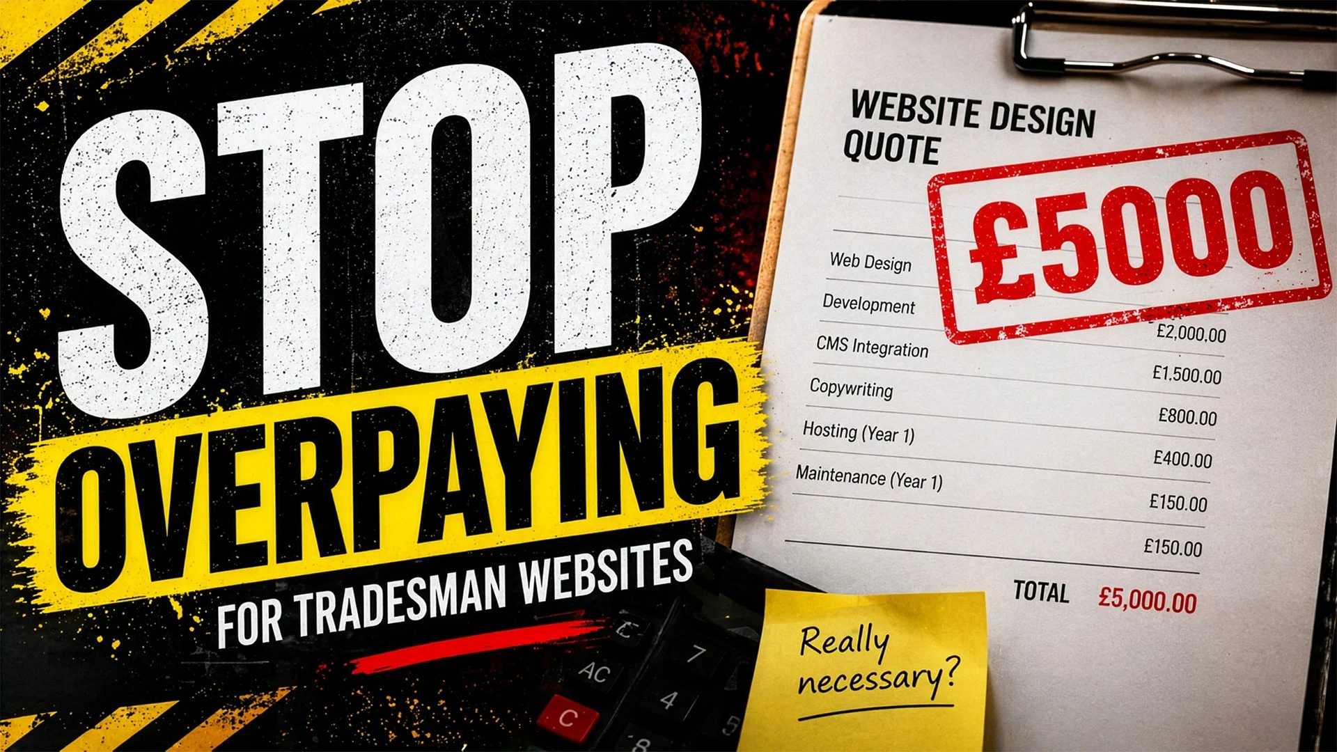
A professional tradesman website with the basics done right (clean design, working contact form, real photos, professional email, SSL) starts at £297 as a one-off build, with hosting at roughly £10 per month. That’s £657 over three years, and the asset belongs to you. Compare that with three years on Checkatrade at around £3, 600, rented attention, no ownership, reviews disappear if you stop paying.
Branding-specific costs (logo, brand colours pulled from the trusting-blue or worker-bee-yellow zone, a livery design that matches the website) typically add £200–£500 if you want them custom. Most tradesmen don’t need bespoke logo work; the most-shared assets across trade brands are: a strong colour, a legible typeface, and a clean website that actually loads. Spending £5, 000 on a “rebrand” is rarely the right move for a one-van outfit. Spending £297 on a website that doesn’t say “Your Heading” in the services section absolutely is.
The cheap shortcut is what costs you. The audit found six in seven tradesman websites underperforming, and the common pattern was a builder who used a template, never replaced the placeholders, and walked away with the money. The price wasn’t the problem. The lack of follow-through was.
So what do you actually do about it?
I’m not going to pretend this is complicated. It’s not.
If you don’t have a website at all, you’re invisible. A basic tradesman website starts at £297 and can be live within a week. That’s less than two months of Checkatrade fees and you own it outright. For the full cost breakdown, read our pricing guide.
If you have a website but you’ve never really looked at it, go look at it. Right now. On your phone. Fill in your own contact form and see if the email arrives. Read every word. Click every link. Check the footer. The 10-point audit checklist will walk you through exactly what to look for.
If your website was built years ago and never touched since, it’s a ticking time bomb. Outdated WordPress installs are how the audit found casino spam injected into one electrician’s HTML and “THIS DOMAIN IS FOR SALE” banners on a heating engineer’s homepage. WP Sentry handles security, updates and backups for £49/month so the site you’ve already paid for stays alive without your attention.
This isn’t about being a tech person. It isn’t about caring about web design. It’s about pride in your work showing up everywhere your work is visible. Your van. Your uniform. Your tools. Your website. Each one is a surface where your standard of care either shows or doesn’t.
The customer doesn’t separate “the tradesman who fixed the boiler” from “the website I found him on.” They’re the same impression of you. So make sure the impression you want to send is the one you’re actually sending, across every surface.
installs are how the audit found casino spam injected into one electrician’s HTML and “THIS DOMAIN IS FOR SALE” banners on a heating engineer’s homepage. WP Sentry handles security, updates and backups for £49/month so the site you’ve already paid for stays alive without your attention.
This isn’t about being a tech person. It isn’t about caring about web design. It’s about pride in your work showing up everywhere your work is visible. Your van. Your uniform. Your tools. Your website. Each one is a surface where your standard of care either shows or doesn’t.
The customer doesn’t separate “the tradesman who fixed the boiler” from “the website I found him on.” They’re the same impression of you. So make sure the impression you want to send is the one you’re actually sending, across every surface.
Your website is your van. Act accordingly.
FAQ
How important is branding for a tradesman?
Critical. Customers form an impression in about three seconds, mostly from visual signals, your van, your uniform, your website, your invoice, your follow-up. Each is a touchpoint where your standards are visible or absent. Branding for a tradesman isn’t logo design, it’s the consistency of those signals. A clean van with a broken website creates cognitive dissonance and customers default to whoever’s signals are aligned, even if their work is worse.
What colour should a tradesman website be?
It depends on what you do. Plumbers, electricians, locksmiths, bathroom fitters default to trusting blues, these communicate competence and reliability. Trades that work on-site under load (scaffolders, demolition, civils) lean into worker-bee yellow and black, which read as ruggedness and presence. The rule: match the colour to the brand-personality dimension your trade actually occupies. Don’t default to agency-flavoured ‘modern minimal’ templates, that pulls your brand into sophistication, which is the wrong dimension for the trades.
Does my website affect how customers see me?
Yes, significantly. Most customer journeys start with a recommendation but end with a Google search. Your website is what customers find, often on their phone, while deciding between you and the next search result. A clean, professional website confirms the recommendation. A neglected one creates doubt. The customer doesn’t consciously think ‘this website is dated’, they just feel something’s off, and they keep looking.
What makes a tradesman look professional online?
Six things: a working contact form, real photos of your own work (not stock images), a professional email address on your own domain, an SSL padlock in the browser, a current copyright year, and a phone number that’s clickable on mobile. None of these are expensive, they’re standards. Having them tells customers something about every other standard you hold.
Comments
Tradesman Website Branding: Your Website Is Your Van (2026)
Article Updated on May 5, 2026

Quick answer. Your website is your van. Same business, same craft, same standard expected. Most tradesman websites fail this test, not because tradesmen are bad at their work, but because the website was treated as an afterthought.
This piece is about why pride in craft demands pride in website, with the brand-personality framework that explains why trade brands live in ruggedness × competence, and what a “dirty van online” looks like, quantified from an audit of 350 sites.
Already know your site doesn’t say what you want?
See what “done right” actually looks like.
Want the data behind it?
I audited 350 tradesman websites in South London. The dirty-van numbers are below, full audit linked.
A good tradesman would never turn up to a quote in a van with peeling vinyl, a cracked bumper, and last week’s McDonald’s on the dashboard. You know why. The van says something before you open your mouth. It tells the customer whether you take your work seriously. Whether you pay attention to detail. Whether you give a shit.
Your website is your van now. And most of you are driving around in the digital equivalent of a Transit with bald tyres and a missing wing mirror.
I don’t say this as an insult. I say it as someone who’s spent the last few months auditing 350 tradesman websites across Kingston, Sutton, and South West London, and who found that only about 1 in 7 were genuinely doing their job. The other six in seven had broken contact forms, placeholder text nobody ever replaced, copyright dates from 2011, casino spam injected into the code, and in one memorable case, a “Book A Visit” button that sent customers to a completely different business.
What surprised me wasn’t the state of the sites. It was who they belonged to. These weren’t cowboys. They were proper tradesmen with decades of experience, hundreds of five-star reviews, Gas Safe registrations, City and Guilds certificates, family businesses going back generations. Masters of their craft. Absolute professionals in every part of their work except one: the bit the customer sees first.
Tradesmen are designers. Most of you just don’t know it yet.
Here’s something I think most tradespeople never hear: what you do is design.
Not design in the graphic design sense, with Macs and mood boards. Design in the fundamental sense: solving problems within constraints to create something that works and lasts.
Think about the last time you ran pipework through a tight space. You had to account for the existing joists, the fall angle for drainage, the access points for future maintenance, and how the finished boxing would look in the room. You were balancing function against aesthetics against practicality against building regulations, all simultaneously, in real time, standing on a ladder. An architect would call that spatial problem-solving under constraints. You call it Thursday.
An electrician designs circuits. The wire gauge, the ring configuration, the consumer unit layout, the positioning of sockets and switches so they’re functional and invisible at the same time. A builder designs spaces. A roofer designs the protection layer between a family and the weather. A tiler designs surfaces that have to be level, waterproof, and beautiful for 20 years. A landscaper literally reshapes the earth into something someone wants to look at every morning with their coffee.
Every trade involves taking raw materials, understanding constraints, and creating something that works and lasts. That’s design. And if you’re a designer, your website is a piece of your design portfolio. Right now, for a lot of tradespeople, it’s the weakest piece in the collection.
Design integrity: why your website is a surface, not a separate thing
In branding, there’s a concept called “design integrity.” It means that every touchpoint a customer encounters should reflect the same standard of care. The quote document. The invoice. The van livery. The uniform. The way you leave a site after finishing. The follow-up call. The website. Each one is a surface where your standards are either visible or absent.
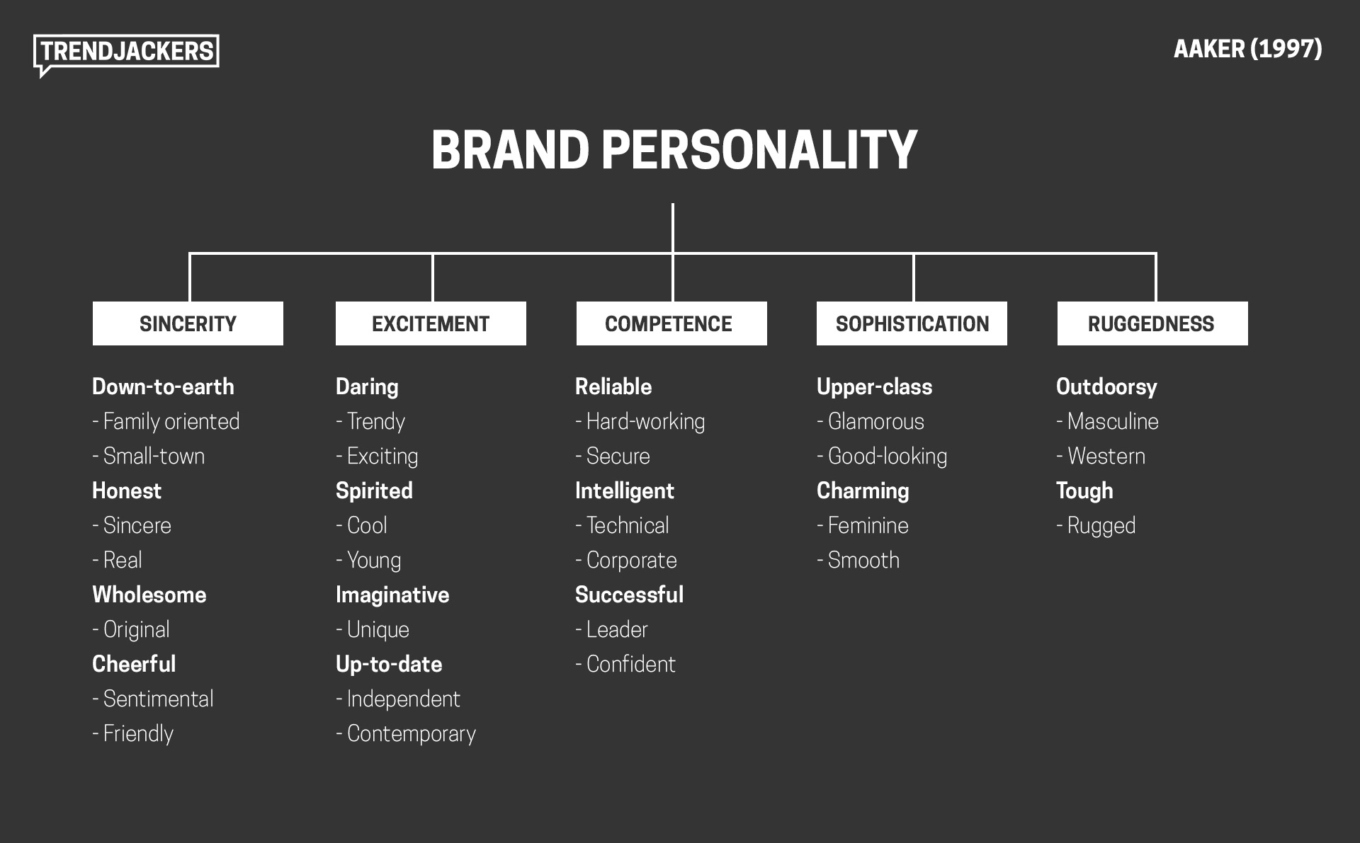
Jennifer Aaker’s brand personality research at Stanford (Aaker, 1997, Journal of Marketing Research) identifies five dimensions customers use to judge businesses: sincerity, excitement, competence, sophistication, and ruggedness. For tradespeople, the dimensions that matter are competence and ruggedness. Sincerity is one-dimensional. Excitement is gimmicky. Sophistication reads as agency-flavoured, the wrong signal entirely. Competence and ruggedness are where trade brands live. The sense that this person knows what they’re doing, and gets it done.
You can see the position before you read the theory. Most trade brands default to trusting blues for the competence half: plumbers, electricians, locksmiths, bathroom fitters. The ones that work on-site under load default to worker-bee yellow and black for the ruggedness half: scaffolders, demolition crews, civils. Hi-vis isn’t fashion. It’s a brand-personality choice that tradespeople made before they knew the term. The colour you wear, the colour on your van, the colour on your invoices: it’s all the same coordinate.
Your work communicates competence. Your van communicates ruggedness. Your website should communicate both. When tradesman website branding fails, it doesn’t fail by choosing the wrong dimension. They fail by inheriting some web designer’s “modern, minimalist” template that pulls the whole brand toward sophistication. That’s a different brand, in a different industry, talking to a different customer.
When it communicates neither, because it’s running a template from 2016 with “Your Heading” in the services section and an @hotmail email as the primary contact, there’s a gap between who you are and how you appear. In psychology, that gap is called cognitive dissonance: the discomfort a person feels when they encounter conflicting signals.
“Dave said this plumber is brilliant” is signal one. “But his website looks like it was abandoned five years ago” is signal two. The customer has to resolve the conflict, and they usually resolve it by choosing someone whose signals are aligned. Even if that someone does worse work than you.
We explored how deliberate, unconventional design choices can actually strengthen a brand when they’re intentional. LingsCars looks chaotic, but every design choice is deliberate. The tradesman websites in my audit aren’t making deliberate choices. They’re making no choices at all. That’s the difference between a bold brand and a neglected one.
The dirty van problem, quantified
Every tradesman I know has an opinion about other tradesmen’s vans. You notice the ones with fresh livery and organised racking. You notice the ones with duct tape on the bumper. You draw conclusions from both.
Customers do the same with your website, except your website gets seen before your van does.
From the 350 websites I audited, here’s what “a dirty van” looks like online:
What I found in 350 sites
| # | Failure mode | Sites | % of 350 |
|---|---|---|---|
| 1 | Broken or placeholder images | 47 | 13.4% |
| 2 | Stale copyright dates (pre-2025) | 41 | 11.7% |
| 3 | No mobile viewport tag | 37 | 10.6% |
| 4 | Gmail or Hotmail business email | 18 | 5.1% |
| 5 | No SSL certificate | 14 | 4.0% |
47 had broken or placeholder images. Where photos of completed kitchens, rewired fuse boxes, and tiled bathrooms should be, there were transparent 1×1 pixel GIFs, grey SVG rectangles, and base64-encoded blanks. One landscaper’s portfolio section was entirely populated with invisible placeholder files. His customers see a gallery of nothing.
37 had no mobile viewport tag. Their sites don’t resize for phones, meaning text is unreadable and buttons are untappable on the device 60%+ of their customers are searching from.
41 had copyright dates from before 2025. I found footer years of 2011, 2015, 2018, 2020. One had 2027, which is a different kind of carelessness but equally telling.
18 used Gmail or Hotmail as their business email despite owning a professional domain. d_p*@hotmail.co.uk on a site that says “Professional Plumbing Services” is the online equivalent of turning up to a quote in paint-stained joggers.
14 had no SSL certificate. Chrome displays “Your connection is not private” as a full-screen warning before the visitor sees the homepage.
These aren’t edge cases. This is what a significant proportion of tradesman websites actually look like. And every one of these businesses is paying for Checkatrade or MyBuilder on top, building a reputation on platforms they don’t own while the platform they do own undermines that reputation with every visit.
Daniel Kahneman’s research on decision-making shows that humans feel the pain of a loss roughly twice as intensely as the pleasure of an equivalent gain. Every customer who lands on your broken website and quietly calls someone else is a loss you never see. The job you didn’t get. The review you didn’t receive. The referral that never happened. Invisible losses, compounding silently, month after month.
Your competitor’s work isn’t better than yours. His website is.
This is the one that should sting.
Somewhere in your postcode, right now, there’s a tradesman whose work is mediocre. You’ve probably seen it. Sloppy finishing, shortcuts in the materials, customers who aren’t fully satisfied but don’t want the hassle of complaining. But he’s got a website. A proper one. Clean, mobile-friendly, his phone number at the top, real photos of his jobs (even if the jobs aren’t that impressive to a trained eye), a few Google reviews, a professional email address.
When a homeowner in your area searches “plumber Kingston” or “electrician Sutton” or “roofer New Malden, ” that guy shows up. You don’t. He gets the call. He gets the job. Not because he’s better. Because he’s visible and you’re not.
And here’s the part that really burns: he probably knows his work isn’t as good as yours. He’s seen your work on the same street. He knows. But it doesn’t matter. Because the customer never got far enough to compare the actual work. The comparison happened on Google, and on Google, he won. Because he showed up and you didn’t.
In marketing, Byron Sharp calls this “physical availability”: being present at the moment a customer is looking to buy. You can be the most skilled tradesman in South London, but if you’re not physically available when someone searches for your trade in your area, the less skilled but more visible competitor wins. Every single time.
This is the part where competitive pride should kick in. Not vanity. Professional pride. The same instinct that makes you redo a joint that nobody will ever see, because you know it’s there and you know it’s right. The same standard that makes you stay an extra hour to get the finish perfect. That standard should apply to your website too. Because your website is visible. And your competitor’s is better.
Shortcuts cost more than they save
Every tradesman knows that shortcuts come back around. The pipe joint you didn’t solder properly leaks in six months. The wire you didn’t terminate correctly trips the board. The wall you didn’t key before plastering cracks within a year. Shortcuts don’t save time. They defer cost and multiply it.
Your website is exactly the same.
The £200 you saved by going with the cheapest web designer who used a template and never replaced the placeholder text? That’s costing you enquiries every single day. When I audited sites in South London, I found ALBDECO in Kingston with unrendered template variables like {{total_slide_count}} visible to visitors. I found Dr H2O in Carshalton with a misspelled javascipt:void(0) breaking every navigation link. I found Mitcham Plumbing with a copy-paste error referencing “Paving Team” on a plumbing website, because the template was built for a different trade and nobody checked.
These aren’t bad businesses. They’re businesses that took a shortcut on the website and are now paying for it in ways they can’t see. The cost of the shortcut isn’t the £200 they saved. It’s the customers who land on the site, see the problems, and leave without making contact. Those invisible departures are the real price.
In copywriting, there’s a principle called “information scent, ” coined by researchers at Xerox PARC. The idea is that visitors are constantly scanning for clues that they’re in the right place. The first five words they read determine whether they stay or leave. If those words are “Your Heading” or “Paving Team” on a plumbing site, they leave. The scent is wrong. The trail goes cold.
Pride in craft means pride in everything
The best tradesmen I’ve encountered aren’t just good at the technical work. They have standards that extend beyond the job itself. The van is clean. The tools are organised. The quote arrives the same day. The invoice is clear. The follow-up call happens. The guarantee is honoured. There’s an attention to detail in every interaction, because professionalism isn’t something you switch on and off. It’s a standard you hold everywhere or nowhere.
This is what separates a tradesman from a craftsman. A tradesman does the work. A craftsman takes pride in the complete experience. The customer who receives a clear quote, gets text updates, sees a branded van pull up, watches a tidy and efficient job, and then finds a professional website when they go to leave a review, that customer doesn’t just recommend you. They insist. They become your marketing department, for free, because the total experience was remarkable.
Content has been building brands this way for centuries. John Deere launched a farming magazine called The Furrow in 1895, not to sell tractors but to help farmers do their jobs better. It’s still running today. The history of content marketing goes back over 300 years, and the principle has never changed: provide genuine value and people trust you, recommend you, and stay loyal. Your website is your version of The Furrow. A piece of useful, professional content that works for your business around the clock.
Ling Valentine of LingsCars built a £40 million business on a website that every design agency in Britain would call terrible. But it works because every element is intentional. The chaos is deliberate. The personality is real. The transparency is radical. It’s not about having the prettiest website. It’s about having a website that reflects who you actually are. For Ling, that’s anarchic and unapologetic. For a tradesman, it should be competent, trustworthy, and proud of the work.
The legacy argument
Some of the best trade businesses in South London have been running for decades. Family names that mean something in their communities. Businesses where the son learned from the father and the grandson is learning from the son. Reputations built over 20, 30, 40 years of showing up, doing the work right, and standing behind it.
That kind of legacy doesn’t happen by accident. It happens because someone cared enough to build a reputation, maintain it, and pass it on. The name becomes the brand. The brand becomes the business. The business becomes the legacy.
Your website is the digital version of that legacy. It’s the thing that exists after the job is finished, after the customer has paid, after the review has been left. It’s the permanent, public, searchable record of who you are and what you stand for. Ten years from now, when someone Googles your business name, your website is what they’ll find.
Is it going to represent the quality of your work? Or is it going to show “Your Heading” in the services section and “fffffggg” in the footer?
If you’re building something that lasts, and every good tradesman is, your website should reflect that ambition. Not because a web designer told you so. Because your craft demands it. Because you have standards, and those standards don’t stop at the front door of the customer’s house.
What your website says about you (whether you chose it or not)
Professional email on your own domain, or d_s_*@hotmail.co.uk. Copyright 2026, or © 2011. Real photos of your work, or stock images of a model pointing at a boiler. A working contact form, or a form with no submit button. SSL padlock in the browser, or “Not Secure” in red.
Each pair sends a signal. The left column says “I take this seriously.” The right column says “I don’t.” And the customer reads these signals in about three seconds, usually on their phone, usually while deciding between you and the next search result.
The tradesman who takes care of these details isn’t spending more money. A professional email costs £5 a month. An SSL certificate is free. Updating a copyright year takes 30 seconds. Real photos come from your own phone camera. These aren’t investments. They’re standards. And having them tells the customer something about every other standard you hold.
What does tradesman website branding actually cost?
This is the question every tradesman skips to. Fair enough, the article so far has been about why branding matters; if you’re convinced, the next question is how much.
The honest answer is: less than you’re already spending on Checkatrade, and you own the result.
A professional tradesman website with the basics done right (clean design, working contact form, real photos, professional email, SSL) starts at £297 as a one-off build, with hosting at roughly £10 per month. That’s £657 over three years, and the asset belongs to you. Compare that with three years on Checkatrade at around £3, 600, rented attention, no ownership, reviews disappear if you stop paying.
Branding-specific costs (logo, brand colours pulled from the trusting-blue or worker-bee-yellow zone, a livery design that matches the website) typically add £200–£500 if you want them custom. Most tradesmen don’t need bespoke logo work; the most-shared assets across trade brands are: a strong colour, a legible typeface, and a clean website that actually loads. Spending £5, 000 on a “rebrand” is rarely the right move for a one-van outfit. Spending £297 on a website that doesn’t say “Your Heading” in the services section absolutely is.
The cheap shortcut is what costs you. The audit found six in seven tradesman websites underperforming, and the common pattern was a builder who used a template, never replaced the placeholders, and walked away with the money. The price wasn’t the problem. The lack of follow-through was.
So what do you actually do about it?
I’m not going to pretend this is complicated. It’s not.
If you don’t have a website at all, you’re invisible. A basic tradesman website starts at £297 and can be live within a week. That’s less than two months of Checkatrade fees and you own it outright. For the full cost breakdown, read our pricing guide.
If you have a website but you’ve never really looked at it, go look at it. Right now. On your phone. Fill in your own contact form and see if the email arrives. Read every word. Click every link. Check the footer. The 10-point audit checklist will walk you through exactly what to look for.
If your website was built years ago and never touched since, it’s a ticking time bomb. Outdated WordPress installs are how the audit found casino spam injected into one electrician’s HTML and “THIS DOMAIN IS FOR SALE” banners on a heating engineer’s homepage. WP Sentry handles security, updates and backups for £49/month so the site you’ve already paid for stays alive without your attention.
This isn’t about being a tech person. It isn’t about caring about web design. It’s about pride in your work showing up everywhere your work is visible. Your van. Your uniform. Your tools. Your website. Each one is a surface where your standard of care either shows or doesn’t.
The customer doesn’t separate “the tradesman who fixed the boiler” from “the website I found him on.” They’re the same impression of you. So make sure the impression you want to send is the one you’re actually sending, across every surface.
installs are how the audit found casino spam injected into one electrician’s HTML and “THIS DOMAIN IS FOR SALE” banners on a heating engineer’s homepage. WP Sentry handles security, updates and backups for £49/month so the site you’ve already paid for stays alive without your attention.
This isn’t about being a tech person. It isn’t about caring about web design. It’s about pride in your work showing up everywhere your work is visible. Your van. Your uniform. Your tools. Your website. Each one is a surface where your standard of care either shows or doesn’t.
The customer doesn’t separate “the tradesman who fixed the boiler” from “the website I found him on.” They’re the same impression of you. So make sure the impression you want to send is the one you’re actually sending, across every surface.
Your website is your van. Act accordingly.
FAQ
How important is branding for a tradesman?
Critical. Customers form an impression in about three seconds, mostly from visual signals, your van, your uniform, your website, your invoice, your follow-up. Each is a touchpoint where your standards are visible or absent. Branding for a tradesman isn’t logo design, it’s the consistency of those signals. A clean van with a broken website creates cognitive dissonance and customers default to whoever’s signals are aligned, even if their work is worse.
What colour should a tradesman website be?
It depends on what you do. Plumbers, electricians, locksmiths, bathroom fitters default to trusting blues, these communicate competence and reliability. Trades that work on-site under load (scaffolders, demolition, civils) lean into worker-bee yellow and black, which read as ruggedness and presence. The rule: match the colour to the brand-personality dimension your trade actually occupies. Don’t default to agency-flavoured ‘modern minimal’ templates, that pulls your brand into sophistication, which is the wrong dimension for the trades.
Does my website affect how customers see me?
Yes, significantly. Most customer journeys start with a recommendation but end with a Google search. Your website is what customers find, often on their phone, while deciding between you and the next search result. A clean, professional website confirms the recommendation. A neglected one creates doubt. The customer doesn’t consciously think ‘this website is dated’, they just feel something’s off, and they keep looking.
What makes a tradesman look professional online?
Six things: a working contact form, real photos of your own work (not stock images), a professional email address on your own domain, an SSL padlock in the browser, a current copyright year, and a phone number that’s clickable on mobile. None of these are expensive, they’re standards. Having them tells customers something about every other standard you hold.